Faversham Life
Faversham Life
Words Justin Croft Photographs Justin Croft
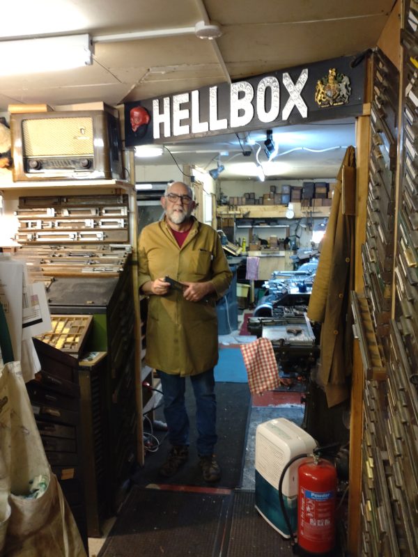
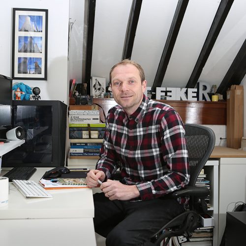
Ed Denovan welcomes us to the Hellbox Type Foundry
To step into Ed Denovan’s Hellbox Letter Foundry in Faversham is to pass into another dimension. Heaven or hell ― it is among the most extraordinary workshops Faversham Life has yet encountered.
An immense line casting machine
Heavy machinery in motion, a chorus of interconnected components, and the reek of printer’s ink, molten metal and casting oils assail all the senses at once. It’s no surprise that printshops have historically been cast as diabolical places where ‘printer’s devils’ (apprentice presshands) shuttled to-and-fro between presses and type-cases assisting in the dark art of turning type and ink into printed pages.
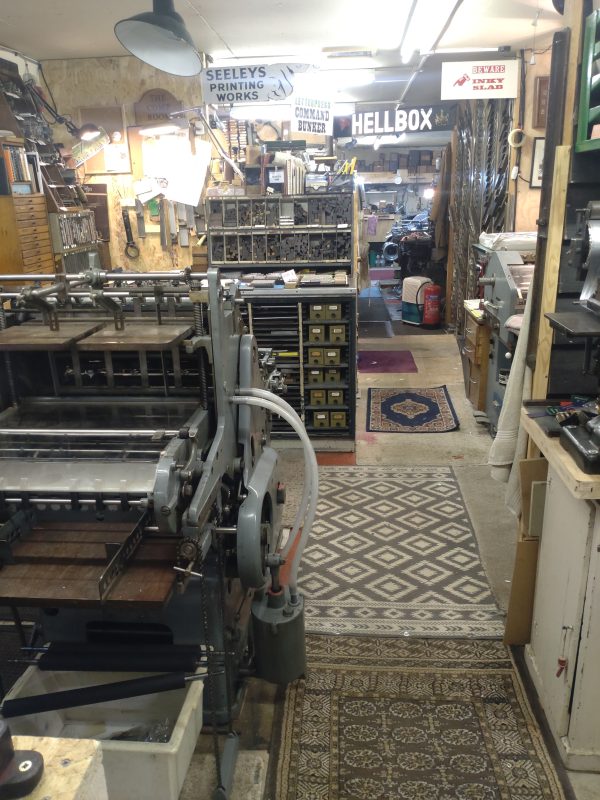
More than a shed
But Ed welcomes us to his domain with infectious enthusiasm and invites us to pick our way between the presses and casters. We’re stunned by the sheer number of different machines ranged over the concrete floors of what Ed affectionately calls his ‘shed’ (it looks rather more than that to us). It’s probably the largest gathering of working machinery of this type left in the British Isles and arrived in Faversham from all corners of Britain and Europe, some craned into position before the shed roof was finished. As printing firms decommissioned old machinery in the transition to litho and digital processes in the 1980s and 90s, Ed was astute in collecting what had become unwanted technology.
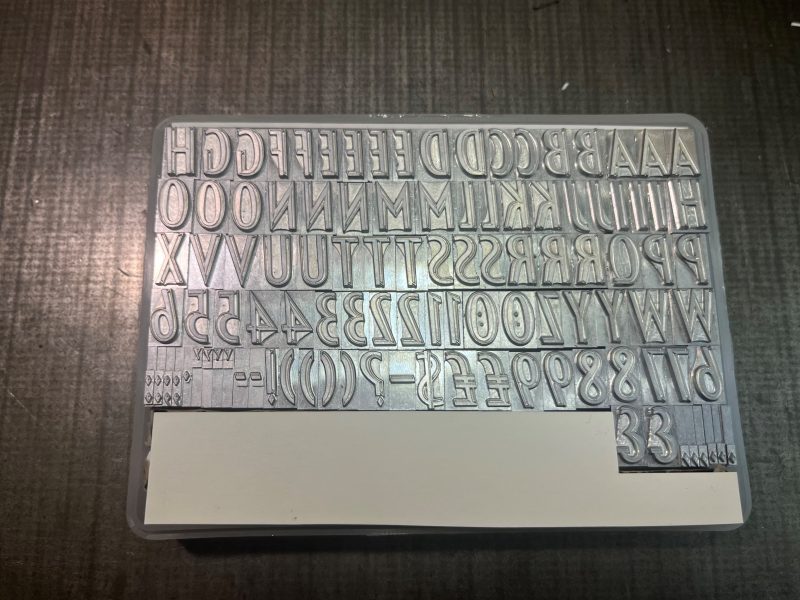
Until just a few decades ago most printing involved pressing an inky surface (words or images) onto paper with immense force in a press. Text was printed from cast lead type. Originally each piece of type was a single letter or character (a ‘sort’) to be assembled with great skill by a typesetter. A complete set of these sorts is referred to as a fount.
A fount of newly cast ‘Festival’ type, first designed by Philip Boydell for the Festival of Britain, 1951
By the end of the nineteenth century, technology had moved on so that whole words or lines could be cast together (as ‘slugs’) to save time, but the principles remained roughly the same since Johannes Gutenberg of Mainz first cast metal type in Europe back in 1436 and they are the foundations of what the Hellbox Foundry does today.
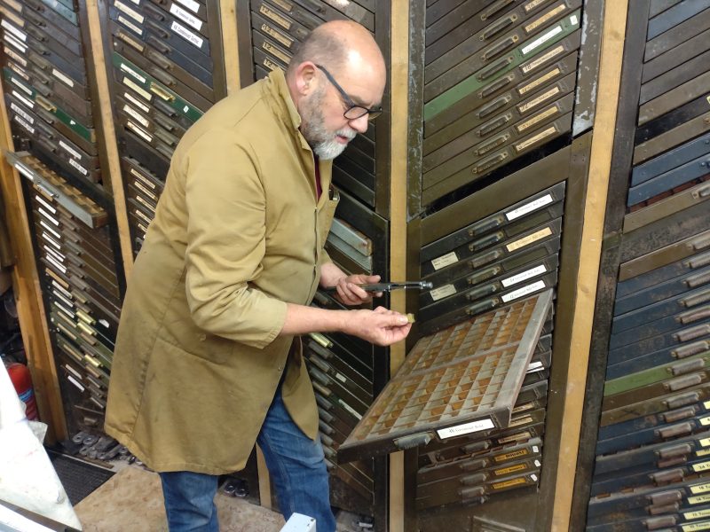
Selecting type matrices from their cases
We are surrounded by metal type. An entire wall is given over to sliding typecases arranged in zigzag diagonal formations allowing the typesetter (our host) access to the masses of type matrices in strictly arranged compartments. Elsewhere are dotted masses of boxes of wood and card full of the distinctive grey metal types. Ed Denovan has collected type for years and has amassed a dizzying array of styles, some of whose designs date back to the sixteenth century. As we know from the dropdown menus on our computers, type styles (‘fonts’) have evocative names, sometimes taken from their historical designers. Among the labels on the typecases we spot Garamond, Bembo, Caslon and Jenson, all giants in the history of printing, their fonts still in common use today.
Historic typefaces in an original type catalogue
A glance at Instagram (you can find the Hellbox Foundry at @hellboxletterfoundry) shows us that letterpress printing from types like this has recently seen a big revival. From high-end artistic presses to kitchen sink craft projects, it obvious that many are fleeing the soul-sucking tyranny of the screen to explore the magic of traditional print on paper.
But Ed goes several steps further at Hellbox. He’s been printing since a teenager at his Essex technical school back in the sixties ― he credits a particular teacher who gave him access to a dormant printshop in the school’s drawing office in return for producing dance tickets and concert programmes. After a successful career as an engineer he has used his retirement to learn the art of the type caster. In this he is almost unique in Britain.
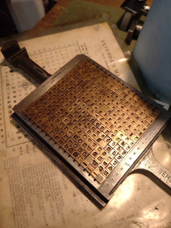
Type matrices in brass (12 point Bembo)
Every letter in a letterpress typeface is cast from a precision-engraved mould called a matrix and these precious matrices were cut in brass, a material tough enough to withstand repeated castings. Sets of matrices were costly to produce and many printshops hired them by the day to cast their fonts from. Ed explains that they would be sent out by rail and signed for at the station, to be sent back to the foundry by return. They are now very much rarer than the lead types cast from them, but Ed has amassed a considerable collection from which he casts type himself.
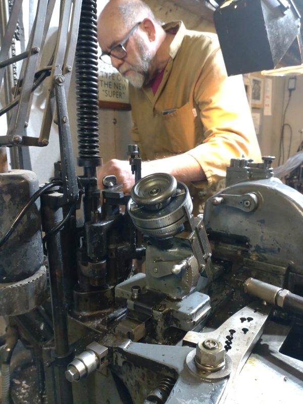
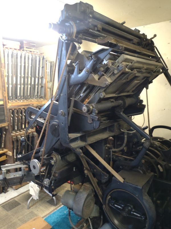
A Monotype Super Caster in action
Casting is an astonishing process and the machines Ed has installed and reconditioned are devilishly complex. A Monotype Super Caster (designed in the twenties) is up and running for us, its air- and water-cooling systems humming and clattering. Gingerly stepping closer to this cast iron beast, we see the origins of the foundry’s unmistakable smell ― a huge metal ingot suspended on chains is being slowly consumed by heat, melting into a silvery reservoir of liquid metal.
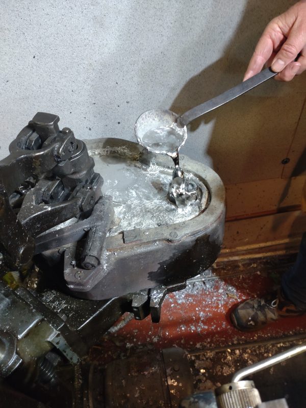
Handling molten lead on the Super Caster
It’s an alloy of lead (mostly) combined with proportions of tin and antimony to give the required qualities of mouldability, hardness and precision. The metallic soup heaves a little around a nozzle as it is injected into the founding compartment where a single brass matrix, hardly bigger than a thumbnail, gives shape to a shiny new piece of type. It seems a crazy concentration of force and energy for such a tiny product, until we see that not just one, but a whole series of tiny lead ‘sorts’ pop out of the caster in rapid succession in a perfectly ordered line. It is mesmerising.
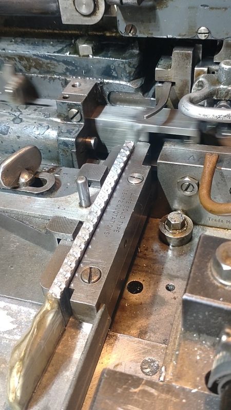
A row of newly cast type sorts pop out of the Super Caster. Spot the holly motifs.
We are just beginning to understand the diabolical connotations of the printshop when Ed points out a starburst splatter of greying lead on the ceiling above us ― the indelible mark of another caster’s error years ago and a reminder of the dangerous potential of misjudging the casting nozzle. At our feet, below the caster, is a bin full of misshapen and broken type, lead offcuts and shavings ― a recycling bin traditionally referred to by printers as a ‘hellbox’.
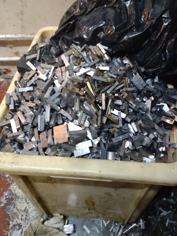
The eponymous hellbox, full of spoiled type and offcuts for recycling
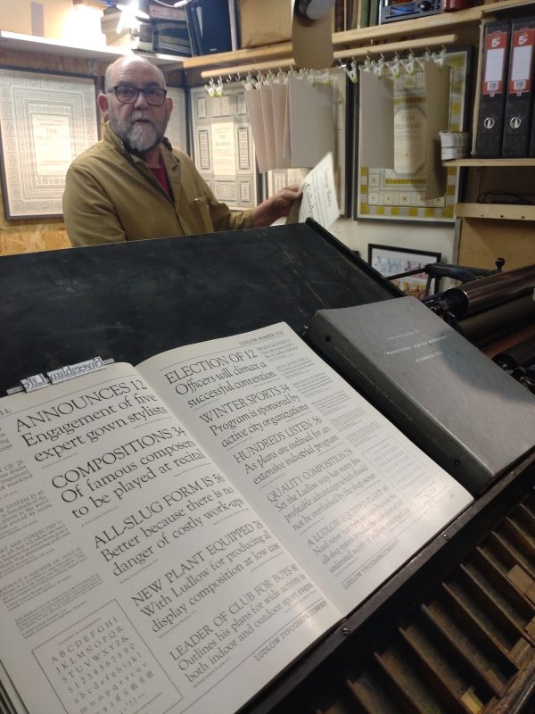
By now we are itching to see a piece of Ed’s type reproduced on paper. He’s kindly prepared a slug of type for us on the neighbouring Ludlow caster choosing a striking ‘Goudy’ display face, a typeface both bold and traditional (which we think entirely appropriate for Faversham Life).
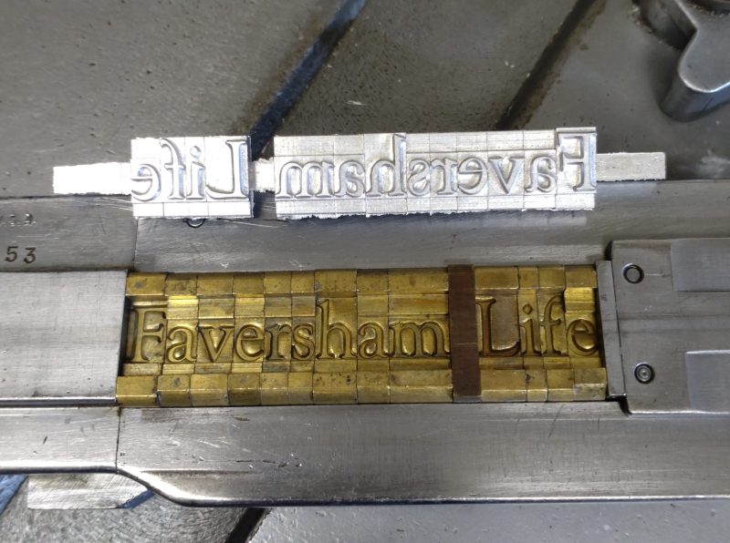
Our cast type slug (above) and its matrix (below)
He sets it up in a moment, locking it into position for the proofing press and deftly applying a viscous vermilion ink to the type surface.
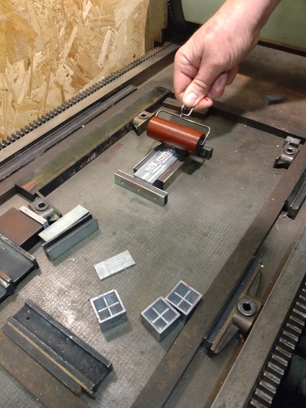
Vermilion ink
Prepared for the proofing press
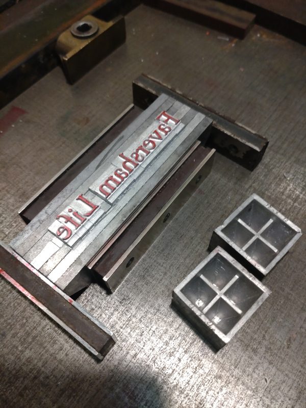
Onto that he lightly drops a slip of good paper before submitting it to many hundreds of pounds of pressure beneath the press’s roller.
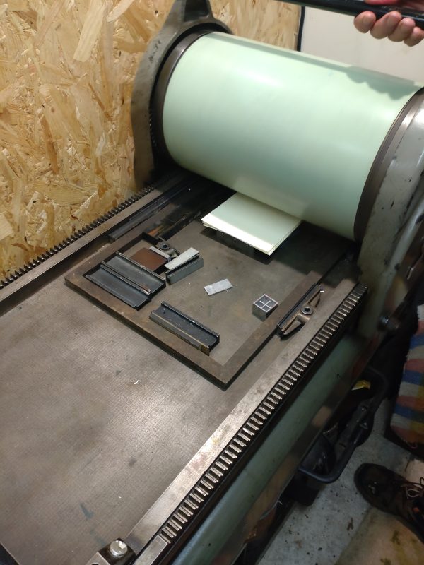
Inked and ready to roll
We’re delighted with the perfectly judged product, so crisply impressed in the paper.
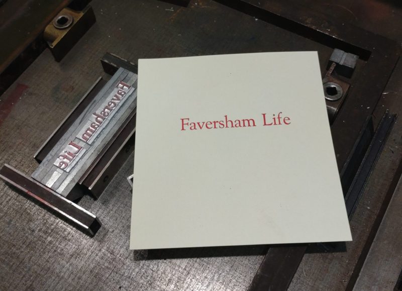
Et voila… Faversham Life in print
After an hour in the Hellbox Foundry we have surrendered our souls to the art of print on paper, heads spinning from following the technological chain from type matrix, to casting type and setting it up and printing it. Faversham Life in print? It’s a thought, but one for our next editorial meeting.
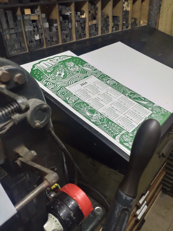
The Hugh Ribbans 2024 calendar
Ed Denovan can be contacted at hellboxletterfoundry@gmail.com He supplies cast founts for letterpress printers and a variety of short-run printed goods to order. His most recent job was for Hugh Ribbans, for whom he prints a stylish calendar every year, available via Tales on Market Street and other selected outlets.
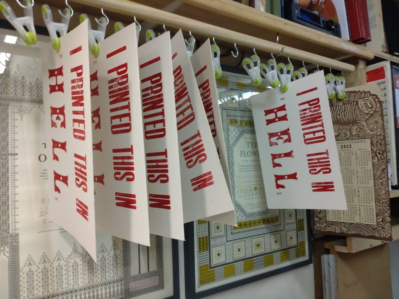
Apprentice pieces from previous visitors on the drying rack